Easy Website Makeover Tips to Take Your Website from Cluttered to Clean
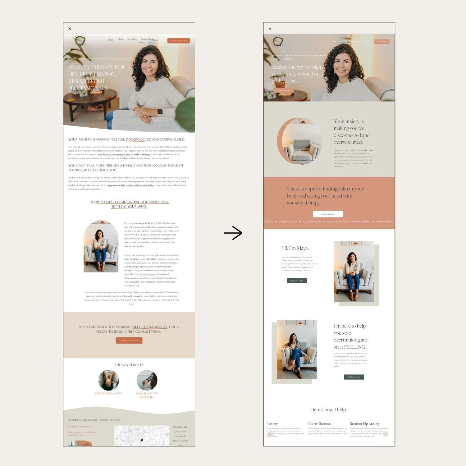
We recently had the pleasure of working with Maya Gengarelli-Ribot on her therapy practice website, Tree Ring Counseling.
Here are key takeways you can use for your own website:
Tip #1 The amount of writing on your website matters.
Most people want a clean, minimal, airy, spacious look on their website.
Similar to home decor, if you want that minimal aesthetic, you have to pare back the knick knacks, right? For your website to have that clean feel you have to be judicious about choosing your words.
But, it can be hard to know what to trim back. Look for these things:
Unnecessary words.
Try to get right to the point and keep your sentences short.
Passive voice.
Read our article about how to spot and fix the passive voice in your writing.
“Walls of text.”
Long sections of small text are daunting and hard to read (break up your text with skimmable headings, new sections for new ideas, and bullet points).
Jargon.
Instead use simple, every day language.
Conversational flow.
Try reading it out loud to see if the language flows (or if it’s bulky, confusing, or redundant).
Tip #2 Use more “white space”.
If you look at the “before” photo (above) you will see that written content and visuals fill up the page almost from end to end.
In the “after” photo you can see we used more “white space” (aka, “negative space”) around all the elements, and between the different sections which does a couple things:
Shorter sentence line lengths improve readability (80 characters or fewer is the ideal per Web Content Accessibility Guidelines WCAG)
More negative space allows the reader to digest content before being presented with more or new ideas
Highlights your content and lets it shine with fewer distractions
Tip #3 Work on your headings (the design & the content).
We created a bigger visual contrast between her headings and her paragraphs.
Contrast is a design technique to help make layouts more visually compelling. When things look too similar on a web page, it is hard for the user to know where to look. When they don’t know where to look they may feel overwhelmed or confused and exit your site.
The headings are not only visually larger than the paragraph text but also a different style of font. We used a “serif font” (classic, elegant) for the headings and the paragraphs are a “sans serif font” (modern, clean). This creates more contrast and visual interest.
And of course we worked on the content of the headings as well to make sure they were short, sweet, and on-message.
Tip #4 Less can be more.
We pared back on the number of design elements that were being used. Design elements include things like: font choices, button styles, image shapes, accents and highlight, stock photos and more.
In the original design there were:
9 items in the navigation
6 different border styles
1 underline style
5 different image shape styles
We pared back to:
6 items in the navigation
1 border style
No underlines, added scrolling text
2 image styles
Tip #5 Be consistent with your choices.
Similar to what we’re saying above about having fewer design elements, you want to also make sure to repeat them throughout your site to create a cohesive feeling or theme.
Each page should look related to the next! For example, when you click away from the Homepage, it can be distracting to be met with a completely different vibe.
If you’re using Squarespace, one easy way to keep things consistent is to use Saved Sections. That way you can quickly and simply repeat sections on different pages without having to remember or create the style!
Custom Web Design Services for Therapists
Want hands-on help with crafting your writing and creating your website?
Work with us for a Website-in-a-Week! Just need a little help getting over tech intimidation? Try our Live Support Service for a power hour of website guidance to get results fast.


